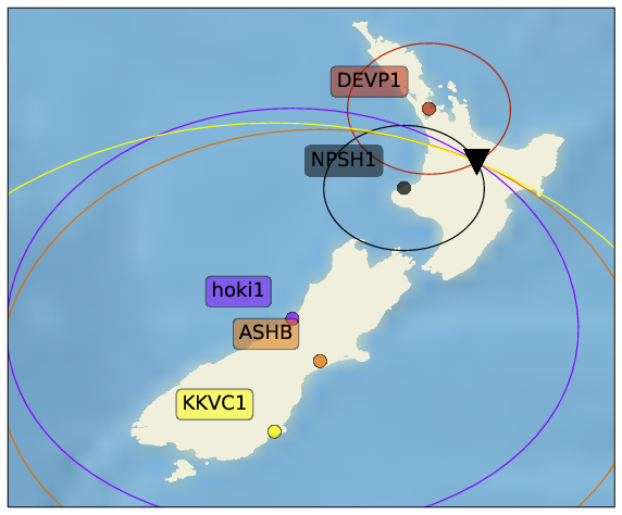
The “textbook” method to estimate the epicentre of an earthquake is based on the arrival time difference between the primary and secondary seismic wave. From this time difference, we can estimated the distance from the station to the earthquake; in other words, from a single station, we know the earthquake happened anywhere on a circle centered on the station, where the radius is the estimated epicentral distance. The intersection of at least three station’s circles provides an estimate of the epicentre.
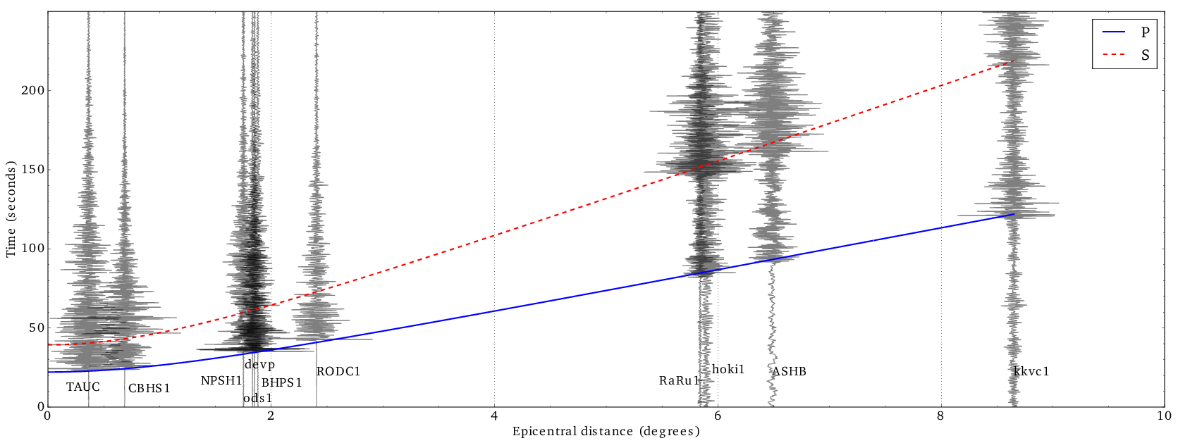
But how do we get the radius for each circle? In the figure below, you can see the seismograms from several of the Ru seismic stations for an earthquake near Rotorua, plotted as a function of their distance to Rotorua. The red and blue curves are predicted arrival times for the primary and secondary wave, based on a spherically symmetric earth. We made this figure for a publication in the European Journal of Physics, but the jupyter notebook that generates these figures is available here.