Category Archives: earthquakes

posts tagged with “earthquakes” are related to the discussion of events we recorded.

Tracking an earthquake across Aotearoa

Last evening, local time, all stations of our network recorded seismic waves from an earthquake to our North and East toward the Kermadec Islands. We get many earthquakes from this area, as it’s on the boundary between the Pacific and the Australian tectonic plates. (For more info, visit this page.)
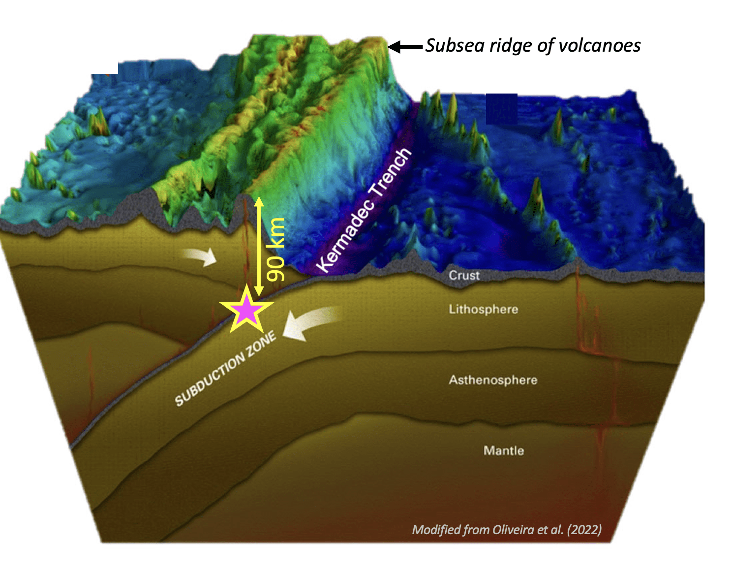
Cross-section of the Earth in the Tonga-Kermadec subduction zone. The colour map is seafloor bathymetry (dark blue being the deepest). The approximate depth and location of the earthquake from September 8th 2023 is shown as a star.

Below are the screenshots of the recordings from 4 of our stations. From top to bottom they are: Kiwi North Museum in Whangārei, Te Kura o te Pāroa in Whakatāne, Waimea College in Nelson, and the Otago Museum in Dunedin. The stations are ordered from North to South. Can you spot the differences?
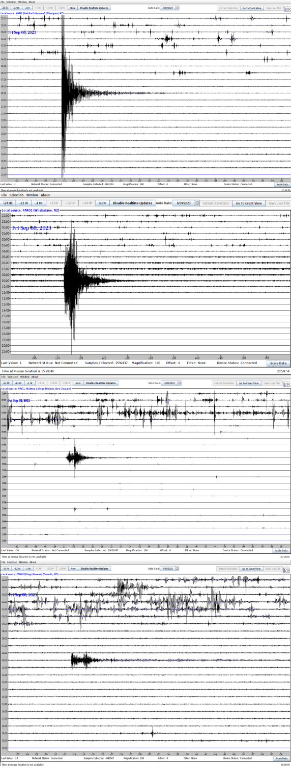
In all snapshots the earthquake signal stands out against the noise earlier in the day. The noise was from you all leaving school/museum, but the earthquake arrived at your station when there was nobody in the building.

As the seismic waves move across Aotearoa from North to South the amplitude decreases, because the energy in the seismic waves decrease away from the earthquake.

But do you see another pattern happening from North to South? In the North, the seismic energy looks like a sharp triangle, but as you go further South two separate triangles emerge! This is because earthquakes generate many seismic waves. Have you heard of P- and S-waves? The P-waves are faster than the S-waves, but close to the Earthquake the P-wave has not had time to outrun the S-wave.  Further away from the Earthquake the difference in speed between these waves becomes very clear.

If you made it this far in this post, maybe you want to know a bit more. What we said in this post is true, but the devils is always in the details. Because the earth is not homogeneous, the wave propagation is complicated. In addition to the attenuation of the waves and the splitting of the different arrivals, seismologists will study this earthquake to learn more about the earth between the Kermadecs and here. For example, the distance between the Earthquake and Whangarei is not very different to the distance between the Earthquake and Whakatane! So why are their signals different? It is because the waves “saw” different rocks on their way.


Earthquake swarm in Bay of Plenty

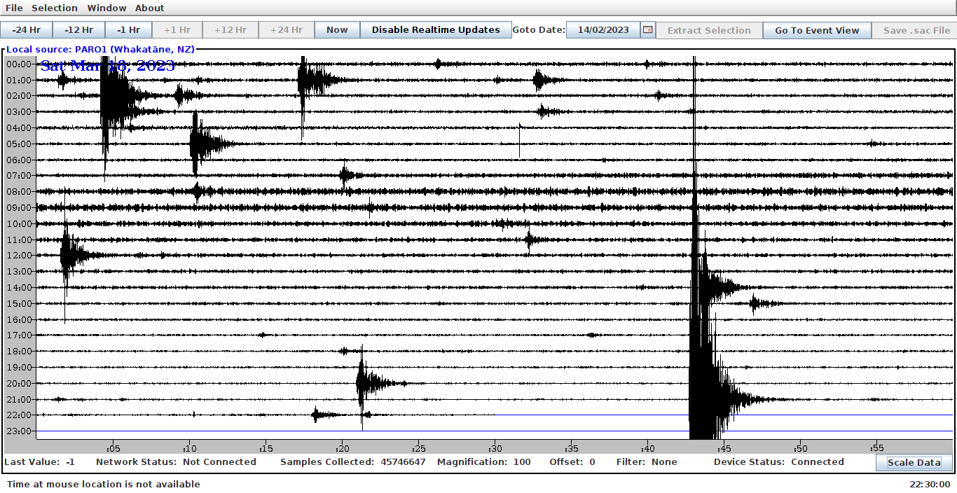
In the last two days the Bay of Plenty has been shaken by hundreds of earthquakes, some greater than magnitude 4, and most of them relatively shallow (less than 15km) . This means shaking at the surface has been significant, but we have not read of any people getting hurt, thankfully. Our whānau at Te Kura O Te Pārao are less than 20km from the middle of this swarm, and the evidence on their station is clear:

The region has been at the mercy of Tāwhirimātea *and* Rūaumoko in recent months an our thoughts are with those enduring the shaking while recovering from the recent storms.

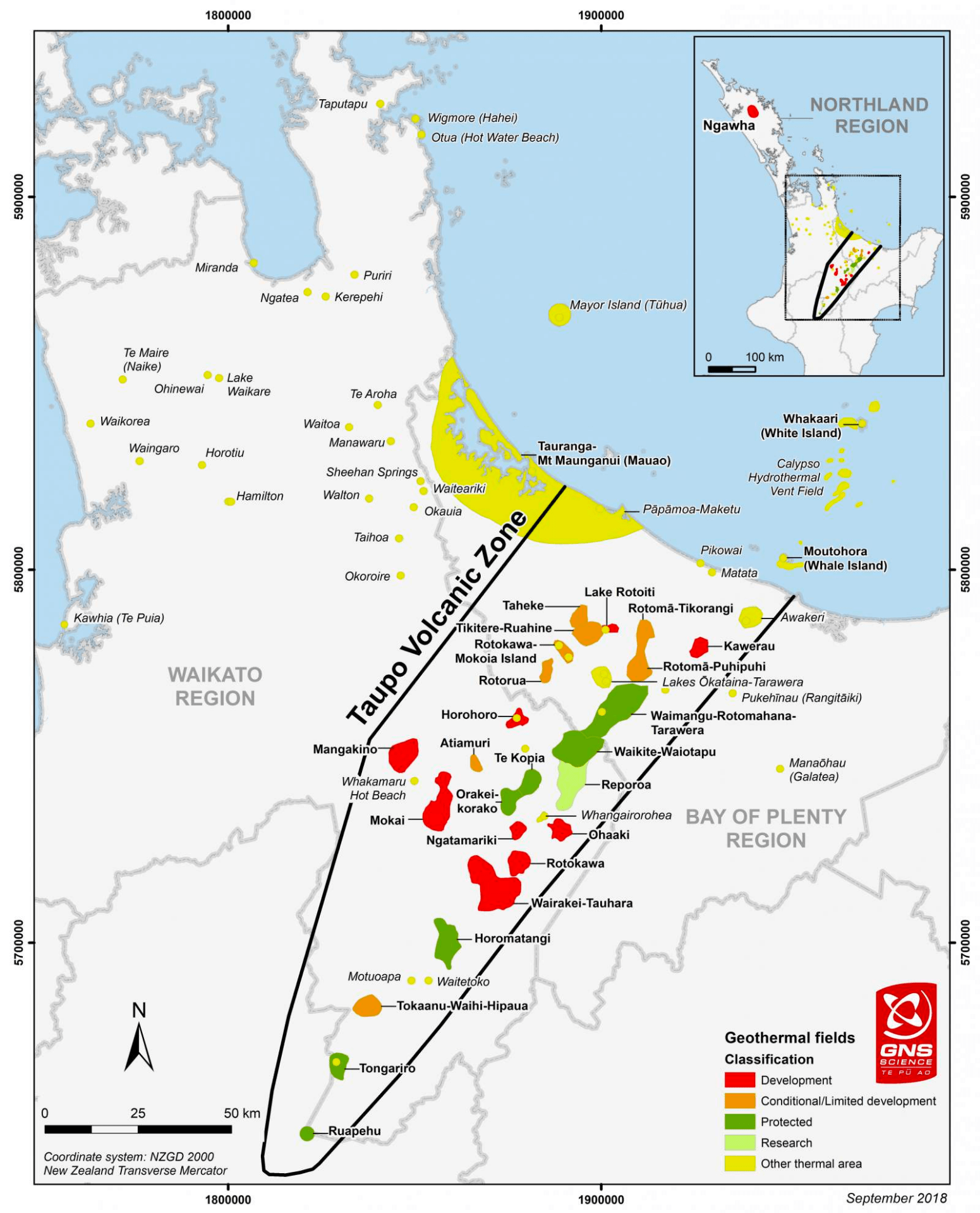
This particular swarm appears to happen very near the natural geothermal area of Awakeri, which is part of the surface expressions of the Taupō Volcanic zone (TVZ).  Below is an image from the geothermal website of nz that shows the geothermal areas of the TVZ, including Awakeri:

Geothermal fields of the Taupō Volcanic Zone, courtesy of the New Zealand Geothermal Association and GNS Science.


A Lake Taupō earthquake and earthquake swarms

Last night some of our Rū network members were awoken by an earthquake under Lake Taupō. You can find the estimated epicentre and other information about the earthquake at this page from Geonet. As you can read there, the earthquake’s magnitude was estimated as M4.2. Geonet qualifies this as a “light” event, but if you live in Taupō the shaking probably woke you up! This is because the quake happened only ~10 km from town, where the amplitude of the waves are still relatively large. The same effect can be seen when throwing a rock in the water: ripples are high near where the rock landed, but as the ripples travel away, their amplitude decreases. The distance of this earthquake to the other stations in the Rū network is so large that you probably did not feel its seismic waves, but your TC1 seismometer is sensitive enough to record it. Have a look when you get back to school on Monday!

Taupō-nui-a-Tia college recorded this earthquake, and smaller events before and after.

Lake Taupō is a large caldera volcano. From time to time, Taupō-nui-a-Tia and the surrounding areas see increases in the amount of earthquakes. They often come from a distinct spot. We call this an “earthquake swarm.” Swarms over the years have come from different spots under the lake, and sometimes swarms will stop and start years later in the same location. Exactly why this happens is an area of active research. This particular earthquake is part of a recent swarm from the last weeks. You can read more details about this swarm and seismicity near Taupō here.


Seismic data from the Whakaari (White Island) eruption of December 9th, 2019

Yesterday, an eruption on Whakaari led to injuries and loss of lives. Our thoughts are with the whanau of those affected by this tragic event. We have been getting a lot of inquiries about this eruption, so we decided to write up what we know about the seismology associated with this eruption.

Whakaari is a volcano that is part of the Taupo Volcanic Zone, and forms a small island in the Bay of Plenty.

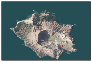
As far as we can tell, none of the Ru stations recorded the signals associated with the eruption, but GEONET operates seismic stations on the island:

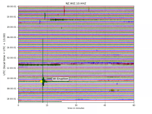
The seismic data for station WIZ are plotted below. We annotated the time of the eruption. You can see that in the day(s) leading up to this, there were some small spikes in the data indicative of small local earthquakes. In addition, we can see a few hours of low-amplitude “rumbling” of Whakaari on the 8th of December:

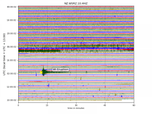
Seismic station WSRZ is closer to the top rim of the volcano, and recorded this:

It looks like the amplitudes of the seismic signals were elevated  on the 7th and 8th of December, but things actually calmed down on the 8th before the eruption…  After the eruption, small impulsive signals may be from brittle failure of the rocks (small earthquakes).

It is difficult — if not impossible — to predict volcanic eruptions, and even after the fact it is hard for us to say whether signals prior to the eruption were out of the ordinary for Whakaari. The experts at GNS have had a elevated warning in place for Whakaari since October, based on seismic signals such as these, and gas sensing. In addition, an M5.9 earthquake at 115 km depth occurred on November 24th with its epicentre about 10km from Whakaari. As with all geological tragedies such as these, we hope we can learn more about the rumblings of Rūaumoku, reducing risk in future calamities.


A jupyter notebook to illustrate earthquake location

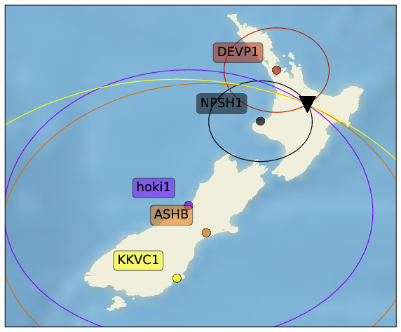
The  “textbook” method to estimate the epicentre of an earthquake is based on the arrival time difference between the primary and secondary seismic wave. From this time difference, we can estimated the distance from the station to the earthquake; in other words, from a single station, we know the earthquake happened anywhere on a circle centered on the station, where the radius is the estimated epicentral distance. The intersection of at least three station’s circles provides an estimate of the epicentre.

mapwithcircles
circles centered on each seismic station represent the epicentral distance to an earthquake. The intersection of all circles is at the epicentre.


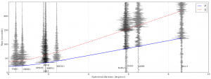
But how do we get the radius for each circle? In the figure below, you can see the seismograms from several of the Ru seismic stations for an earthquake near Rotorua, plotted as a function of their distance to Rotorua. The red and blue curves are predicted arrival times for the primary and secondary wave, based on a spherically symmetric earth. We made this figure for a publication in the European Journal of Physics, but the jupyter notebook  that generates these figures is available here.

rotoruaSP2
The distinct arrivals of the primary and secondary wave are matched with the arrival time curves predicted for a spherically symmetric earth.

M5.8, 30 km north-west of Wanaka

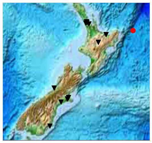
On May 4, 2015, at 2:29:10 UTC, an earthquake with magnitude 5.8 occured 30 km north-west of Wanaka.  Most of the TC1 seismometers of the Ru network recorded the resulting seismic waves.  Check out the map below, where the epicentre of the quake is shown as a red dot, and the stations in the Ru network are shown as black triangles.

RUstationmap

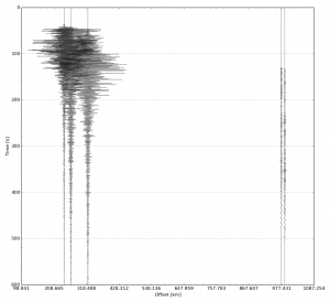
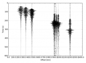
The records of the earthquake motion are called seismograms.  Each “seismogram” is a record of the velocity of the earth at a particular time.  In the figure below, the seismograms are offset horizontally from the left of the graph.  This offset is the epicentral distance (distance from the epicentre) to each station.  The vertical time scale starts at the origin time of the earthquake.


section

There are two important things to notice about this figure.  First of all, Hokitika, Rangi-Ruru, and Ashburton museum stations are the closest to the earthquake and have very similar epicentral distances.   Therefore the the earthquake reaches them at close to the same time, and the stations are spaced close together on the horizontal axis.  Also, notice that these seismograms have large amplitudes and overlap each other.  By contrast, the two stations further away, in Auckland, record the earthquake at later times.  The amplitude recorded on these stations is also smaller, which makes sense because seismic waves spread out as they travel greater distances.

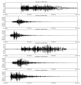
To see the waveforms more clearly, here is a simple plot of what all stations recorded.  Note that the vertical scale of the different plots is not consistent from plot to plot:

stream


Also note that these plots do not look the same.  This is the result of path effects.  To begin with, as seismic waves travel through the earth, the earth attenuates (makes smaller) certain frequencies more than others, and which frequencies it attenuates depends upon which path the quake travels.  Since the waves took different paths to make it to our different stations, the recorded earthquakes look different.  But this is only part of the picture.  Notice that at the two stations which are further away, the seismograms are longer.  In addition to the primary wave (the fastest, which arrives first), there are other, slower waves that arrive later.  The further a station is from the epicentre, the longer it takes for all the waves to arrive, and therefore the recorded quake is longer.

And lastly, here’s a seismic section with data from our Taupo station included.  As you can see, it looks like the earthquake arrives a bit before it should.  The computer clock for this station was not accurate, which shows how important it is for professional seismologists to make sure their clocks are set right! (of course we at Ru understand that’s not always possible with the equipment we provide you).

taupo

Thank you to all the station managers who sent me data!  If you haven’t yet sent me your data, please do, and I can update the figures!

M6.5, 155 km east of Te Araroa

On November 16 2014, at 22:33:17 (UTC), an earthquake with magnitude 6.5 occurred some  155 km east of Te Araroa:
The stations of the Ru network recorded the resulting seismic waves, displayed  in the figure below. The so-called “seismogram” for each station shows the propagation of the vibrations caused by the quake:
The horizontal position of each seismogram represents the distance from the epicentre to each station. The vertical time scale starts at the origin time of the earthquake.

RUstationmap
Black triangles indicate the location of the Ru stations. The red circle is the epicentre of the M6.5 earthquake. Click on the figure to see a larger version.

For example, it takes roughly 180 seconds for the first seismic wave to get to station kkvc1 in Kaikoria Valley, some 1200 km from the epicentre. This means the average speed of this primary (or P-)wave is 6.7 km/s! Over this relatively short distances,  you can almost draw a straight line through the onsets of energy on each seismogram, showing that the wave speed varies only by per cents  in the subsurface under our network.

gisborne2014
Seismograms of each Ru station, organised by distance from the Earthquake. Click on the image to enlarge.

Also, notice how the seismograms change from station to station. For the close ones, the waves are bunched up in a relatively short time span, whereas for those stations with a greater epicentral distance, the “wave train” is longer.  It turns out that in addition to the primary wave, there are other, slower, waves in this wave train. These include secondary (or S-)waves, and surface waves.

Finally, we should mention that the amplitudes of each seismogram are equalised to show the arrival times the clearest.  In reality, the vibrations recorded closer the epicentre are much larger than those farther away.


M6.3 earthquake, 15 km east of Eketahuna

greatcircle

 
In the Science Centre of the City Campus of the University of Auckland we record seismic waves with the TC1 seismometer. Routinely, our station AUCK records seismic waves from earthquakes in New Zealand and beyond. On January 20th, 2014, an earthquake occurred on the South side of the North Island, 15 km east of Ekatahuna. Here is a map of the epicentre, our station location, and the great-circle path between them.


2014-01-20-02-52-44

On the left you can see 10 minutes of recordings, starting at the origin time of this earthquake. The green marker annotated with a Pn is the predicted arrival of the first wave traveling 4 degrees from the epicentre, 15 km east of Eketahuna, to Auckland. This prediction is based on a spherically symmetric model of the Earth, by Brian Kennett, and certainly seems to mark the start of minutes of vibrations in Auckland from this earthquake. In fact, if you look carefully you see that the wiggles after 10 minutes are still larger than before the first wave from this earthquake arrived. Larger earthquakes can make the Earth “ring” for many hours.

2014-01-20-02-52-44_zoom
In the image on the right, we zoomed in on the first-arriving wave, almost exactly one minute after the earthquake originated. Now, you can see that the prediction is actually a few seconds before the arrival. This means the lithosphere under the North Island of New Zealand is a bit slower (~3% on this path) than the average on Earth. In general, a hotter lithosphere is slower than a cold one. This makes seismic waves traversing old, cold, continents relatively fast, and those sampling younger lithosphere like ours in New Zealand, relatively slow.

In general, it is these small travel time differences that provide images of the (deep) earth through a process called seismic tomography.